

If a stranger glanced at your company’s homepage for 10 seconds, do you think they could figure out what you sell and how that’s unique?
Just 10 seconds. That’s how long we get before most website users will decide to stay on a webpage or leave, to look further into working with our company or not.
The homepage, in particular, carries even more weight; it typically garners far more traffic than the other pages and therefore needs to convey who we are and what we do to a ton of strangers and potential leads.
So it’s no wonder the homepage can be the most difficult webpage to master for even the most experienced marketers. And yet it’s worth all the extra effort, as an optimized homepage can positively affect how deep users will dive into your website and thus how much closer they’ll get to working with us.
Project Summary
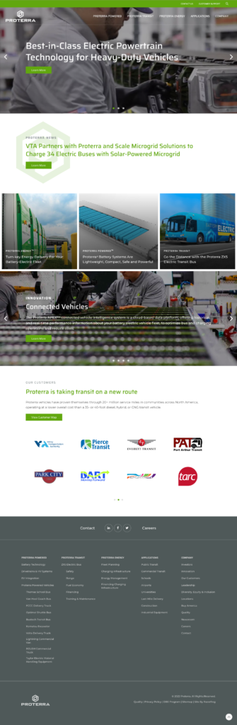
When I worked for Proterra as the digital marketing manager, we realized it was time to redesign our homepage for a number of reasons, not least of all because it had started feeling visually crowded with so many different sliders, images, and links as our company had expanded.
More importantly, we wanted to hone in on our company’s unique value proposition right upfront, connecting that to our Products webpage so users could learn more about our concrete offerings. Additionally, our leadership team asked that we make it clearer that our company had expanded to three distinct business units, showcasing what each offered and how those offerings fit together as a whole EV ecosystem.
So with the help of our incredibly talented team of marketers, creatives, and web developers, I co-led our homepage redesign project in 2022, also proposing the general layout and writing the copy.
Key Features
For our homepage redesign, these were the most important elements we incorporated to strengthen our design and homepage performance:
Strong UVP & CTA
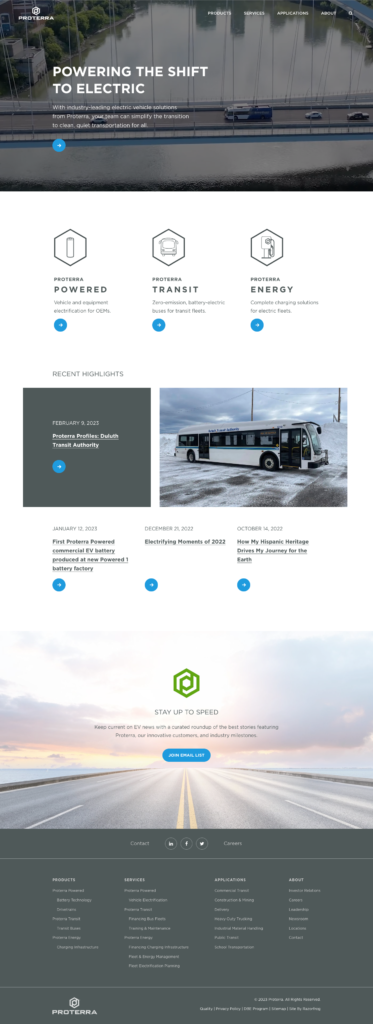
For our header video section above the fold, we highlighted our company’s unique value proposition (UVP), with a succinct message tied to our mission. My goal was to keep this text under 25 words. If you’ve ever tried to capture what your company does in just a few words, you know just how hard this can actually be! We probably drafted 30 or so versions before landing here:
Powering the Shift to Electric – With industry-leading electric vehicle solutions from Proterra, your team can simplify the transition to clean, quiet transportation for all.
This message identified not only what we sell (“electric vehicle solutions,” because we offered batteries, vehicles, and chargers), but also how our offerings are better than the competition (“industry-leading”) and how they make life better for the many OEMs and transit agencies going electric (“simplify the transition”).
In addition, our previous header section included multiple slides that linked to different webpages. But this time around, we created and linked to a single Products page from the header section, where users could see all of our products in one place. This kept our homepage header section unified in both its message and the destination it pointed users to visit.
Business Unit (or Product) Highlights
Since we had three distinct business units that sold different types of products and targeted slightly different audiences, we used the next section to quickly showcase what each BU offers and who it’s for, using both graphic icons and copy. Each element linked to the business unit’s page for more info about their solutions, partners, and contact info.
If your company doesn’t have such distinct BUs, you could still use this space to showcase the main different types of products you provide.
Email List Signup
Our website continued to be a great source for garnering new email contacts, so we also wanted to leverage prime real estate on the homepage to encourage more signups. Here, we included a simple summary of the value we share in our emails and then linked to a page where they could provide their name and email and select their preferred subscriptions.
Your website is a wonderful tool for building an email list, especially if you are offering lead magnets or other valuable assets in exchange for contact info. So don’t miss the opportunity to capture those contacts on the homepage.
Results
With our new homepage design in place, we saw these results:
- Longer User Engagement: We decreased homepage bounce rates from 52.01% to 40.11% (2022 Q4 to 2023 Q1), which meant less users were immediately leaving before any interaction on the page or website.
- More Product Interest: By linking to our Products page from the homepage header video, we increased navigations from the homepage to the Products page by 44.12% and increased pageviews for the Products page by 79.96% (2022 Q4 to 2023 Q1).
- Email Signup Support: With a link to join our email list included on the homepage, we also increased navigations from our homepage to our email signup page by 985.71% (2022 Q4 to 2023 Q1).
Get in Contact
Is your homepage underperforming? I’d be happy to help you develop a stronger UVP and increase conversions to your most important webpages from the homepage. Currently, I’m open to full-time remote marketing roles. Please reach out if you feel we could do something great together.
(Image credit: Image by Gerd Altmann from Pixabay)